MEMO from the publisher
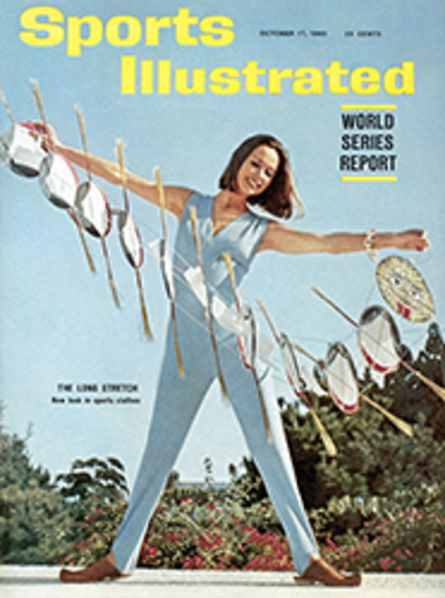
The lettering by which a publication distinguishes its title is called a logotype. As many of you have doubtless observed on this week's cover, ours has changed its style. Describing a logotype is a little like trying to describe a spiral without using your hands. Let it suffice, therefore, that our new logo is a design by Art Director Richard Gangel which strikes our eyes as being a forward step in legibility and attractiveness and is an example of refinements we are continually trying to bring to the pages of SPORTS ILLUSTRATED.
In the world of commerce the logotype is a trademark or symbolic device by which business institutions identify themselves in print and suggest such precious characteristics as quality, reliability and integrity.
They vary as much as the products and services they stand for. Those that form a border to this memo appear, with many others, in this issue, and we like to think they stand as an endorsement, a stamp of approval so to speak, of our own product.
THIRTY FIVE ILLUSTRATIONS

