

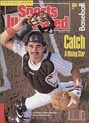
Fabric of the Game
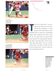
Basketball players don't gripe about the color of their shorts. A football player doesn't get agitated over the stripe on his helmet. The Edmonton Oilers won't be found having heated discussions in the locker room about what makes a classic hockey uniform. But scratch a major league baseball player and you uncover a fashion analyst.
"You've got to have a belt," says outfielder Fred Lynn of the Detroit Tigers. "That's the way uniforms are supposed to be made. For belts."
"I'm a pinstripes kind of guy," says outfielder Kal Daniels of the Cincinnati Reds. "I go for belts and buttons—like the Yankees."
"I like our orange-and-black," says outfielder Candy Maldonado of the Giants. "It looks very nice with that stripe in there, but I wish it said 'San Francisco,' like you see in the old pictures."
"You know what makes the Dodger uniform?" says New York Yankee pitcher Tommy John. "It's the red uniform number on the shirt. I love that."
Maybe it's all those hours spent sitting in the dugout with nothing to do but spit that makes aesthetes out of these athletes. Or maybe it's the nature of the baseball uniform itself. A football or hockey player needs the armor of a tank just to survive, but he gives up his flexibility, his freedom of movement. A basketball player needs plenty of skin exposed to the air to keep his body temperature down, so he sacrifices protection. But a baseball player, with fewer practical demands upon his attire, has a uniform that, functionally speaking, covers all the bases, which leaves him free to devote himself to the finer points of style.
Pitcher Bud Black of the Indians, who has a reputation as something of a fashion trendsetter, has studied the American League in depth from the vantage point of the bullpen. "I like the Tigers' home uniforms," he says. "I like the number of belt loops in the back. I like the Old English 'D.' I like the small pinstripe down the sides. They also have two hats, a road hat with an orange D, a home hat with a white D. I like that they have orange stripes on their shoes on the road and white stripes at home. But I don't like their away uniforms."
Now and then a player feigns indifference, but don't be taken in. He cares. "The Yankee uniform's not bad," says Yankee outfielder Rickey Henderson. "Not bad at all. But they're all the same. There's no uniform I really hate."
What about the 1976 White Sox with those weird collars? "Now that was a bad uniform," says Henderson. "I wouldn't play in that uniform."
Some care more than others. Ken Landreaux achieved a sort of fashion martyrdom in 1980 when, as a Minnesota Twins outfielder, he refused to go along with a front office edict that his blue stirrup socks be worn low enough that the team's logo on the sock show at the calf. But Landreaux liked to pull his stirrups high over his white sanitary socks and pull his pant legs low, so that only a band of colored stirrup ran up either side of his ankles, the way many players wear their socks today.
"That year Landreaux had a good year, a 31-game hitting streak," says Twins media relations director Tom Mee. "But he pouted all summer and refused to wear his socks low, and it caused problems." The next season Landreaux was playing in Los Angeles.
Andy Van Slyke, the Pittsburgh out-fielder, has been observing the march of fashion from dugout level for six years, and has reached the conclusion that it's the man who makes the uniform. "Tommy Lasorda," he says, "wouldn't look good in any uniform, not Dodger blue, Cardinal red or Yankee pinstripes. But Jose Canseco, you could put a so ft ball uniform on him and he'd look like a major leaguer. Then there's [Pirate pitcher] Bob Walk. He goes out there with sunflower seeds and spit on his uniform, old gum, pine tar and resin, coffee stains on his pants, burns from cigarettes, and he hasn't shaved, but somehow he looks good. Even if he's getting his butt beat, he looks good doing it."
Pitcher Ron Darling of the New York Mets sees a uniform as a philosophical statement. "The more conservative the look, the better," he says. "That's why I wear my socks so low. Me and [Yankee third baseman Mike] Pagliarulo like our socks real low. We're both from Massachusetts. We believe in the hardworking, nothing-fancy work ethic. I like to think of myself as a puritan, or maybe a Calvinist in a baseball uniform."
Tommy John is a traditionalist. "The best uniforms historically are the Yankees', Dodgers' and Cardinals'," he says. "But the greatest of all time may have been those old baggy Milwaukee Braves uniforms with the tomahawk across the front. What a wonderful uniform."
The celebrated architect Mies van der Rohe liked to say, "God is in the details." If he was right, then baseball must be on close terms with the Almighty. Although the characteristic elements of the uniform—short-legged pants and long socks—were set in 1867 and have not changed, the rest, the details, have been in a state of constant flux. The uniform has been added to, subtracted from, embellished and streamlined with such frequency and imagination that the only constant in its long history is change.
A few of the changes have survived; most have sunk under their own weight, victims of fickle fashion, public ridicule or plain absurdity. In 1876, Albert G. Spalding, a defector from the Boston Red Stockings, became pitcher-manager of the Chicago White Stockings. Being an ambitious young man, Spalding, on the side, founded a sporting goods business that supplied the Chicago team with uniforms and eventually grew into a commercial empire. That was Spalding's good idea. Another, less laudable, idea of his was to assign a cap of a different color to each field position, which someone said made the White Stockings look like "a Dutch bed of tulips."
At present, baseball is caught up in a wave of nostalgic fervor, a postmodernist period, designers might say. Teams are reaching into their pasts for a button here, a belt there, adding pinstripes, abandoning color, rehabilitating long-neglected symbols. Two years ago the Atlanta Braves revived the old Milwaukee tomahawk, which originated with the Boston Braves. And last year the Oakland Athletics added an elephant patch to their sleeves, a relic of the long-ago feud between John McGraw's New York Giants and Connie Mack's Philadelphia Athletics. When McGraw said the Athletics were a bunch of white elephants, Mack responded to the slight by adopting the animal as the team's insignia and in 1918 ordered elephants to be embroidered on his team's shirts.
The groundwork for the elephant revival was laid by A's equipment manager-Frank Ciensczyk. "I've been sending the office stuff on the elephants for years," he says. "They finally decided to use it." The A's are also now wearing traditional whites at home and grays on the road, a major turnaround for the team that created a sensation in the '70s when it broke the uniform color barrier by boldly rotating combinations of green and yellow.
Now the Athletics' mix-and-match era is history. So, too, is San Diego's five-year flirtation with a brown-and-orange-and-yellow scheme that Padres first baseman Steve Garvey said made him feel like a taco. And the Houston Astros are no longer the human Popsicles they once were: The red, yellow and orange rainbow that covered their chests from 1975 through '86 has diminished to mere stripes on shoulders and sleeves. Who knows? If the traditionalist trend persists, the '90s could see a return to baggy flannels.
Down through the years, baseball team owners and managers have seemingly been unable to resist the impulse to use their players as living, breathing mannequins. The tendency to tinker with the attire is a compulsion almost as old as the uniform itself—and that, by most historians' reckoning, dates from 1849, when the New York Knickerbockers took the field in approximately matching outfits of blue trousers and white shirts.
The greatest of the tinkerers was McGraw. In 1901, when he became player-manager of the Orioles, gray was already the conventional color for road uniforms. McGraw, a fiery third baseman who sharpened his spikes with a file and instructed his teammates to do likewise, was also an innovator of style whose excursions into color make Charlie Finley's look reactionary. In 1901, McGraw ordered up a road uniform for the Orioles in the colors of the team bird—black cap, shirt and pants, a yellow belt, and yellow-orange stockings with black stripes. But the laughter from one end of the new American League to the other proved too much even for McGraw. After one season he struck his colors and the team went back to gray.
In 1902, McGraw jumped to the National League, and as manager of the Giants startled the fans by dressing his 1905 and 1911 teams in black for the World Series. But that was before McGraw hit on violet. At first he used it only as trim, but in 1916 the Giants wore flannels woven with thin purple lines that gave a violet effect. The "NY" emblem on the left breast was violet and so was the trim on the team's pillbox hat.
But the age of innovation that was ushered in by McGraw finally bottomed out on Aug. 8, 1976, when Bill Veeck's White Sox made their debut in the "hot-weather version" of a uniform designed by Veeck's wife: navy-blue Bermuda-length shorts and striped knee socks topped with a white nylon pullover with a floppy navy half-collar. That idea survived only through two other games, but as a publicity grabber it was a Veeck-style triumph.
Not all baseball owners have shared in the passion for innovative style; some, in fact, have fought uniform change as if it were a communist plot. From 1970 through 1984, Cincinnati players chafed, literally, under management's insistence that they wear old-fashioned heavy wool stirrup socks cut low around their ankles. The players called them ankle chokers. "I hated those old socks," says outfielder Eric Davis. "So did everybody else. I used to stretch those babies until every thread popped." Catcher Johnny Bench claims he finally found something the ankle chokers were good for: "Duck hunting. You could go out any morning, no matter how cold, and stay warm as toast."
The Reds also insisted on traditional black shoes long past the time when shoe companies began paying players handsomely to wear their brands in more stylish tints. "I'm a colorful man; I don't even wear black shoes when I get dressed up," says Davis, who now makes six figures for wearing red shoes manufactured by Nike. Says Reds manager Pete Rose, "Bob Howsam [former Reds president] used to say he was against white shoes because it would distract the fans' attention from the ball. How could he think that?"
The Reds were not entirely inflexible. In the mid-'70s, the Reds were approached by John Nash Ott, a retired banker who is founder and director of the Environmental Health and Light Research Institute in Sarasota, Fla., an organization that studies the effects of light on human physiology. Ott persuaded the Reds' management it could improve both hitting and fielding by changing the undersides of the bills of the players' caps from green to gray. Gray, Ott said, was soothing to the pituitary gland and the central nervous system. Whether their pituitaries were soothed or not, the confused Reds went back to green, only to return to gray last season.
The quandaries of color have, at times, become nearly exponential. Take, for example, the multihued anarchy that reigned in Pittsburgh from 1977 through 1979, when the Pirates had three uniforms—yellow, black, and white with pinstripes—and, with two caps, 18 possible combinations to choose from on any given day. "If it was cold, we'd wear all black," says John Hallahan, the Pirates' equipment manager. "And if it was hot, we'd wear the whites. In the 1979 Series we mostly wore the yellow tops with black pants. The players always voted. One time they wanted each guy to wear a different combination, but we didn't want to make a mockery of it, which of course it already was."
As any good equipment manager knows, the single most distinguishing element of the baseball uniform through history has been the stirrup sock. Yet when the Giants' Willie Mays had his pants tapered in 1960, he launched a trend to ever longer, tighter pants that has lasted almost three decades and that has carried baseball's traditional sock, long an anachronism, to the brink of extinction.
The baseball stirrup, like the human coccyx, is a product of devolution. Just as the coccyx was once a tail, the stirrup was once a full-fledged sock. It protected the foot from blisters and the leg from abrasion, and in some cases it provided a team its nickname: Red Stockings, White Stockings, Browns, Grays, et al. The Detroit team, for instance, was called the Wolverines until 1895; in 1896 the players donned dark socks with horizontal yellow stripes, after which they became known as the Tigers.
For a while the foot of the baseball stocking was white and the rest, the upper portion, was colored, but some time around 1905 the foot disappeared altogether, leaving only a stirrup that passed under the instep. Beneath the stirrup, players wore thin white sanitary stockings. The change may have come about out of fear that the dyes in the stockings were contributing to infection in spike wounds; before antibiotics, blood poisoning was an ever-present threat to limb and life.
Today the stirrup is useless even for purposes of identification, since all that is usually visible is a stripe of color rising out of the player's shoes and disappearing into his pants. Some managements view this style as subversive. They make rules about how many inches of colored sock must show beneath the bottom of the pant leg, and attempt to discipline the nonconformists. Most teams, however, have thrown in the towel. General manager Lou Gorman of the Red Sox says, "The players are supposed to show three inches of sock, but they never do, and we're not strict about it, even though it's a very pretty sock if anybody could see it."
However, in baseball, as in other high fashion, everything eventually comes back into style. Lately a few of the game's more adventurous souls have begun baring their colorful calves again. Pitcher Bob Ojeda of the Mets wears his pants so short they just cover his knees, a reminder of his early playing days. "When I first played Little League, my uniform pants were actually football pants," he says. "All the other kids were wearing blue jeans, but I had a uniform. Okay, it was a football uniform, but so what? I liked it."
Catcher Scott Bradley of the Mariners also shows a lot of sock. "As a kid I always had low stirrups," he says. "To me that was the way a baseball uniform was supposed to be worn. I can remember the first time I put on a uniform, my dad sat me down and said, 'This is the way to do it.' You'd put your sanitaries on, pull your stirrups over them, and then roll your pant leg under so you had that real neat fold there."
Meanwhile, a few teams, such as the A's, have replaced stirrup and sanitary sock with a single knee-length sock that has vertical stripes of color knitted into its sides. If logic applied—which, of course, it does not—the next step would be to eliminate the stripe altogether, at which point the baseball stocking would have come full circle.
History tells us that the saga of the stirrup begins with George B. El-lard, who owned a sporting goods store in Cincinnati and was a founder of the city's baseball club. The Civil War had just ended and baseball mania was sweeping the country, spawning hundreds of new teams in cities, towns and hamlets across the land. In 1867, Ellard proposed uniforms of white caps, white shirts, short pants and long red stockings, and he hired Mrs. Bertha Bertram, a Cincinnati seamstress, to make them. "As the long red stockings were necessarily made to order, they were quite expensive," wrote Ellard's son Henry. "For they were up to that time unknown." The uniforms were a local sensation, and a Cincinnati newspaper reporter began referring to the team as the Red Stockings.
The Red Stockings were as splendid athletically as they were sartorially, and in September of 1869, having beaten the best the East had to offer, the club went west seeking new competition. The San Francisco Chronicle hailed the visitors as "the invincible nine" and remarked that the long red stockings "show their calves in all their magnitude and rotundity." At a banquet later, a San Francisco host raised a farewell toast: "To the Red Stockings—may they never meet the wash in which they are bleached."
As sensational as they were, the Red Stockings were not a financial success, and in 1871 the directors voted to return to amateur ball. But the Red Stockings' Harry Wright, by now the most celebrated player-manager in the game, announced that he and several of the best players were moving to Boston and taking their red stockings with them. By then all teams, great and small, wore short pants and long stockings.
The National Baseball Hall of Fame Museum, in Cooperstown, N.Y., attends to the legacy of the Red Stockings. The Hall has a collection of some 300 uniforms, old and new. Just over half of the collection is on display at any one time; the rest of the uniforms are packed individually in 21- by 36-inch conservation boxes stacked on metal racks in the museum's main storage room.
Until five years ago preservation of the uniforms was a matter of sending them to a commercial dry cleaner for cleaning and mothproofing. "Now we look at dry cleaning as causing more damage than good," says Peter Clark, registrar of the Hall. "The uniforms are extremely fragile." Not surprisingly. The oldest uniform in the collection belonged to a member of the Baraboo Base Ball Club of Baraboo, Wis., and has held together since 1866.
Each year a few of the older uniforms, as many as the budget will allow, are sent to the Museum of American Textile History's conservation center in North Andover, Mass., where they are analyzed, vacuumed for surface soil, immersed in a solution designed to neutralize the acidity of their fibers, patched or rewoven if necessary, blocked, wrapped in acid-free tissue paper, packed and returned to Cooperstown.
Beginning two years ago, baseball uniforms sported a new feature, the word RAWLINGS stitched near the bottom of the right sleeve. The script lettering is only 1½ inches long and half an inch high, but it is a landmark in the history of the game, the first time a manufacturer's name has appeared on the outside of the uniform. In partial payment for that exposure, the Rawlings Sporting Goods Co. provides as many as 210 sets of uniforms for each of the major league teams each year of the contract, free of charge.
Bill Smith is Rawlings' chief uniform measurer. In late February he and his assistants hit the spring training camps, marking their charts with sizes and tailoring instructions. At the end of each day they faxed the charts to the Rawlings factory in Licking, Mo., a farm town of 1,272, 120 miles southwest of St. Louis. (The motto of The Licking News is "The only paper in the world that gives a 'lick' about Licking.")
"On Feb. 22 we get our first charts," says Paul Stickley, the Licking plant manager. "Pitchers and catchers." By the end of March, working two shifts a day, six days a week, Stickley and 150 employees have produced over 20,000 garments, no two of them exactly alike. Once the uniforms are shipped, the folks in Licking hold their breath every time the phone rings at the plant. Despite three quality checks, things can go wrong. What was the worst thing that ever happened? Stickley doesn't hesitate. "We spelled Cincinnati wrong."
This year Rawlings supplied 25 teams with uniforms, though some opted to buy part of their uniforms from other manufacturers. One team chose to stick with its longtime supplier, Wilson, for everything: the New York Yankees.
Probably the most revered uniform in baseball history is the obsolete flannel version of the Yankees' home outfit—navy pinstripes on white with the Yankee logo on the left front of the shirt. Even people who hate the Yankees like that uniform. Movies like Pride of the Yankees had something to do with it, but mostly it was Ruth, Gehrig, DiMaggio and Mantle, baseball's Mount Rushmore.
In the opinion of Yankee equipment manager Nick Priore, who has worked in the New York clubhouse for the last 28 years, nobody ever looked better in a baseball uniform than Mickey Mantle. "His body was just made for it," says Priore. "He wore a 44 shirt and had a 36 waist and a 25 inseam from the day he started playing until the day he retired."
Even those players of today who don't admire the Yankee look admit to a grudging admiration for the Yankees' wisdom in leaving well enough alone. "I don't like the baggy Yankee pinstripe that some people do," says Giants outfielder Brett Butler. "But that's tradition and that's fine. Just like Boston. They're never going to change." But Dwight Gooden of the Mets is a fan. "We look like a bunch of Softball players," he says. "Too many colors. I wish we looked more like the Yankees. Clean pinstripes. A great look."
Clean pinstripes is a great quest for the people who work in an aging factory building on a back street in a rundown section of New Rochelle, N.Y., 10 miles north of Yankee Stadium. The Raleigh Athletic Equipment Corp. cleans the Yankees' uniforms; and while that chore represents only a fraction of the company's business—mostly the reconditioning of athletic equipment for schools in the New York area—pressing the pinstripes is a labor of love. When the team returns from a road trip, Raleigh delivers the home uniforms to the stadium, washed, touch-pressed and repaired, and picks up the used road grays. Most teams don't bother pressing double knits, but the Yankees are not a wash-and-wear sort of organization. "Face it," says Raleigh manager David Sprague. "They have to look professional."
When the Yankees decided to put numbers on the backs of their uniforms in 1929, it was Raleigh that stitched them on. Marc Okkonen knows that. No one in the world knows more about baseball uniforms than Marc Okkonen. Five years ago, Okkonen began documenting the history of major league uniforms in this century (box, page 112). Now he can tell you, for example, that the first graphic symbol of a team nickname in the 20th century was a small red tiger that appeared on the black cap of the Detroit club in 1901. Or, that the Yankees did not invent pinstripes. Okkonen, who moved to upstate New York to be near the Hall of Fame, will tell you that pinstripes first appeared around 1907, and the Boston Doves (later the Braves) were probably the first team to wear them. The Yankees didn't adopt pinstripes until 1912. Okkonen can also tell you that in 1937 Brooklyn turned green: For one season the boys of Dodger blue wore green caps, green sleeves and, of course, green stirrups.
In the beginning, baseball's uniforms could have served just as well for mowing hay as for playing ball: long trousers, wide belts, flannel work shirts. But after 1867, with the meaningful design work having been done, all the uniform needed was 122 years of fiddling. Some of the greatest inventions in history, inventions that have changed the world—the telegraph, the paddle steamer, the cotton gin, to name a few—became obsolete during those 122 years. But the elemental baseball uniform lives on, like the cockroach, perfectly adapted to its environment. Sleeves have been cropped; collars have disappeared; short, baggy flannels have become longer, tighter double knits; red stockings have given way to red shoes. But the game is still baseball, there's no mistaking that.
PHOTO
OZZIE SWEET
NO UNIFORM IS MORE BELOVED THAN THE YANKEE PINSTRIPES, AND NOBODY EVER WORE THEM BETTER THAN MANTLE
PHOTO
LANE STEWART (RED SOX)
DETAILS MAKE THE DIFFERENCE: JACKET PATCH OF THE BOSTON RED SOX (1989); TOMAHAWK OF THE MILWAUKEE BRAVES (WARREN SPAHN, 1955); ELEPHANTS OF THE PHILADELPHIA A'S (JOE BUSH, 1916)
PHOTO
PHOTOFEST (SPAHN)
[See caption above.]
PHOTO
[See caption above.]
PHOTO
JOHN IACONO
YUCK
FIFTY SIX ILLUSTRATIONS
MARC OKKONEN
THREE PHOTOS
FOCUS ON SPORTS
PHOTO
ANDY HAYT
PHOTO
FRED KAPLAN
SEVEN ILLUSTRATIONS
RICHARD PANDISCIO
PHOTO
1
PHOTO
2
PHOTO
3
PHOTO
4
PHOTO
5
PHOTO
6
PHOTO
LANE STEWART
THE HALL OF FAME HAS SOME 300 UNIFORMS, INCLUDING FAMOUS FLANNELS FROM THE GREATS OF THE GAME
EIGHT PHOTOS
LANE STEWART
Egregious Errors lo Fashion
LYNN SQUAWKED LONG AND LOUD UNTIL THE BIRDS FINALLY BROUGHT BACK BELTS
THE WHITE SOX FOLLY WAS AMPLIFIED WHEN MODELED IN 1981 BY GREG LUZINSKI
WILLIE STARGELL'S PIRATES HAD MANY COMBOS, SOME WORSE THAN OTHERS
GARVEY OF THE PADRES FOUND THAT BASEBALL AND BASIC BROWN JUST DON'T WORK
ASTRO NOLAN RYAN: A HUMAN POPSICLE WITH A NUMBER WHERE IT SHOULDN'T BE
JOE RUDI AND HIS OAKLAND CRONIES PLAYED A LOT BETTER THAN THEY LOOKED
Diamond Visions
AMERICA'S TOP FASHION DESIGNERS TAKE A SWING WITH THEIR PENCILS
Geoffrey Beene
WIDELY REGARDED AS AMERICA'S LEADING DESIGNER, BEENE HAS OFTEN USED SPORTS MOTIFS, SUCH AS SEQUINED GOWNS WITH FOOTBALL JERSEY NUMBERS ON THE BACKS. THIS CREATION IS A STREAMLINED ONE-PIECE JUMPSUIT. SHOCKINGLY TRADITIONAL
Willi Wear
JOHN BARTLETT OF WILLIWEAR OFFERS BOTH HOME AND ROAD WEAR. WHEN AT HOME (FAR LEFT), THE NEW YORK PLAYER TAKES HIS CUE FROM THE LACING IN A GLOVE (DON'T YOU LOVE IT!). AWAY, HE TAKES ON THE LOOK OF A MANHATTAN STREET MESSENGER. CHAINS REQUIRED
Betsey Johnson
RETURNING TO HER '60S ROOTS, WHEN SHE PIONEERED STRETCH ELASTICS AND SPORT KNITS AS STREETWEAR, JOHNSON CONJURED UP THIS VISION FOR HER ALL-GIRLS TEAM, THE SWEET-HEARTS. REMEMBER THIS KNIT BODYSUIT, BASEBALL FANS—YOU SAW IT HERE FIRST
Perry Ellis
AS DESIGNED BY MARC JACOBS, THE BOY WONDER OF FASHION, THIS PERRY ELLIS ENSEMBLE OPTS FOR A VARIATION ON THE CLASSIC UNIFORM: T-SHIRT AND REVERSIBLE JACKET INSTEAD OF A JERSEY; LONG SHORTS INSTEAD OF SHORT PANTS. THE WHITE SOX, WE UNDERSTAND, ARE VERY INTERESTED
Michael Leva
USING YANKEE PINSTRIPES AS HIS GUIDE, LEVA HAS CREATED AN OH-SO-PRACTICAL JUMPSUIT, COMPLETE WITH PULL-ON CLEATS. SO, HOW 'BOUT IT, GEORGE?
Andre Walker
SAYS WALKER, THE "ENFANT TERRIBLE" OF FASHION: "BASEBALL PLAYERS ARE THE BEEFEATERS OF AMERICA, AND THEIR UNIFORMS SHOULD EXPRESS IT"
Feathers In Their Caps
IN 1987, THE ORIOLES DECIDED TO CHANGE "THE HAT WITH THE FUNNY LITTLE DUCK HEAD ON IT," AS FRED LYNN CALLED IT. AN ARTIST WAS COMMISSIONED AND, AFTER MODIFICATIONS SUGGESTED BY THE EXPERTS AT THE BALTIMORE ZOO, AN ORNITHOLOGICALLY CORRECT BIRD (ABOVE) WAS FINALLY UNVEILED THIS WINTER—TO THE APPLAUSE OF SEVERAL PLAYERS AND THEIR WIVES. FASHION MARCHES ON
High style, Low style
1
BENCH OF CINCINNATI DISPLAYED THE TRADITIONAL STYLE, WITH LOW STIRRUP AND LOTS OF RED LEG
2
AS A DODGER, LANDREAUX PLAYED AS HE COULDN'T FOR THE TWINS, WITH NO COLOR ROUND THE CALF
3
DARLING OF THE METS WEARS 'EM LONG AND LOW AND SAYS IT'S ALL PART OF THE PURITAN WORK ETHIC
4
DAVIS OF THE REDS SPORTS A THIN RACING STRIPE, THE CHIC AND MINIMAL STYLE PREFERRED BY SOME
5
OTHERS, LIKE THE YANKEES' JAMIE QUIRK, HAVE RETURNED TO THE MORE CLASSIC LOOK, WITH PLENTY OF SOCK
6
CANSECO OF OAKLAND DOESN'T BOTHER WITH A STIRRUP AT ALL; HIS STRIPE IS KNITTED RIGHT INTO THE SOCK
Lots of Sox
THE ILLUSTRATED HISTORY OF THE WHITE SOX UNIFORM
Some five years ago, commercial artist Marc Okkonen set out to document the history of every uniform of every major league team of the 20th century—a task which, understandably, no one had ever taken on before. Okkonen's work, just completed, provides voluminous visual proof of the fickle ways of baseball's fashion czars. In the 89 years, the major leagues have produced nearly 3,000 different uniforms, including 56 significant variations for the Chicago White Sox alone.
1901 HOME
1902 ROAD
1903 HOME
1903 ROAD
1905 HOME
1906 HOME
1909 HOME
1911 HOME
1912 HOME
1914 ROAD
1915 HOME
1917 HOME
1917 ROAD
1917 WORLD SERIES
1918 ROAD
1919 ROAD
1922 HOME
1922 ROAD
1925 ROAD
1926 ROAD
1928 HOME
1928 ROAD
1929 HOME
1929 ROAD
1930 ROAD
1931 ROAD
1932 HOME
1932 HOME (ALT.)
1936 HOME
1938 ROAD
1940 HOME
1940 ROAD
1942 HOME
1947 ROAD
1948 HOME
1949 HOME
1949 ROAD
1959 HOME
1959 ROAD
1965 HOME
1965 ROAD
1970 HOME
1970 ROAD
1971 HOME
1971 ROAD
1976 SPECIAL
1976 HOME
1976 HOME (ALT.)
1981 ROAD
1981 ROAD (ALT.)
1983 HOME
1983 ROAD
1987 HOME
1987 ROAD
1988 HOME
1988 ROAD